We are looking at making the sample selector better visible and what your input!
Why we want to improve it
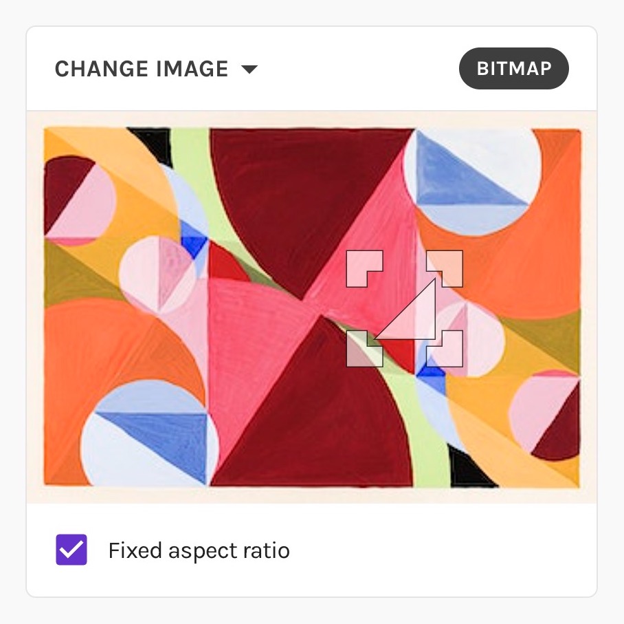
One of the fundamental parts of the Repper app is the sample selector. It shows your current source image and lets your control which part of the image will used as the sample for your pattern.
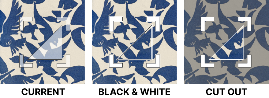
First, I thought I would clearly prefer the cutout. However, then I realized that a gray filter would be put on the rest of the image which would make it more difficult colorwise which parts I should sample. That is why I finally voted for the b&w border. I hope it makes sense.
Hi @Laszlo, thanks for sharing your reasoning! You are right, the downside of the cutout is seeing less clearly the rest of the image. You could imagine that we’d show the image as-is normally but on hovering over the image, you see the cutout. I’ve already tried this and frankly, the jumping between transparent and half-opaque is a bit jarring. It does however solve your concern.
The downside of the black-white version, on the other hand, is that to have those 3 strokes (white-black-white) that make sure you can see it on any background (including black or white backgrounds!), the selector as a whole gets thicker and therefore obscures more of the selection, making it harder to see exactly what is falling within the selection box.
So, there are some trade-offs here, though I’m seeing of there are ways to get the best of both worlds
Also, while I’m looking for a good new default way of showing the selection handles and selection box, of course there is the possibility to add controls to switching the way it looks, for example turning the cutout effect off and on!
(A little design-geeky side note for those interested: Having great defaults is very important in UI design, and while making things configurable will make sure that you can give everyone what they want, it comes at the price of a lot more cluttered UI for everyone, which especially hurts novice users. That’s why you often end up with tucked away setting screens that control those options!)
I had the same concern about the rest of the image being grayed out. It bothers me.
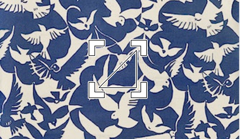
Is it not possible to have the image NOT grayed out, and ALSO the selection triangle? Then, have the area in the selection SQUARE grayed with the ungrayed triangle within.
That would provide good contrast for selecting the area to sample
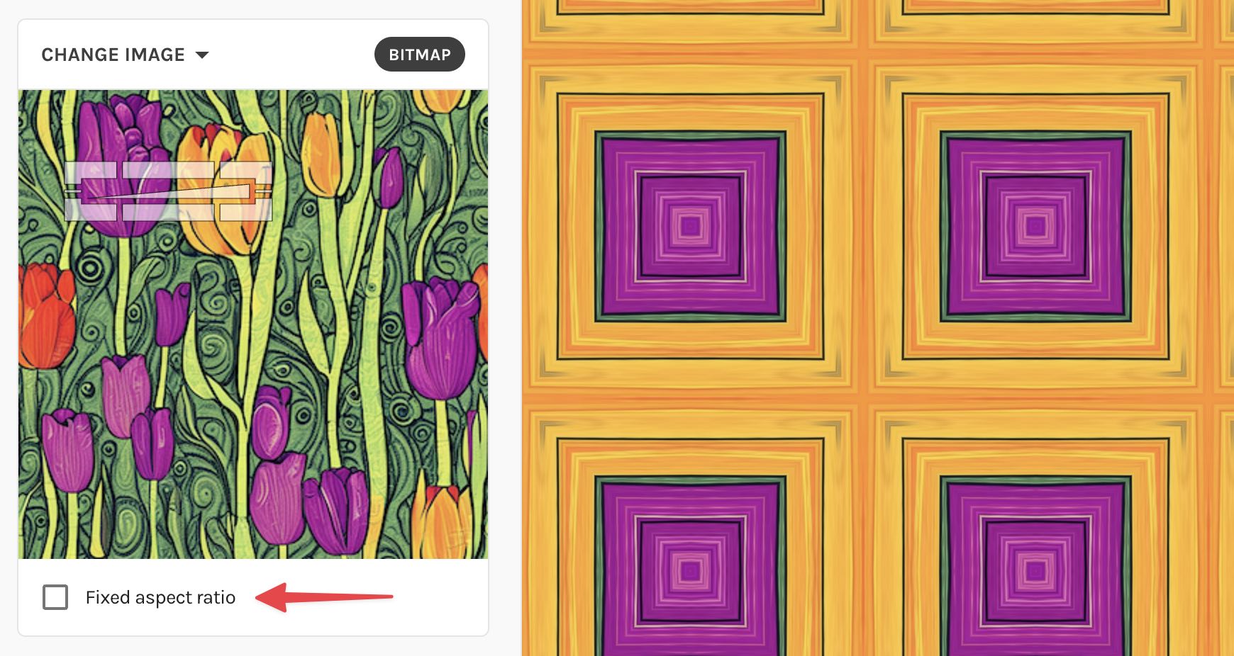
I don’t really mind the style or color, I just wish i could manually write the pixel dimensions of the marker… and not have to play with it to make sure it’s a perfect ratio
Thanks for the additional feature request
Is this only about being able to control the aspect ratio of the selection, or also about its size (in pixels) and its position on the image?
(Why I am asking: once we allow users to set values by hand, it becomes much more challenging to not get into “invalid” states where the selection goes beyond the space of the image, leading to visual quirks and trickiness to recover. We could limit it, but then the challenge is that there are different ways to limit an “invalid” value… If I can avoid that can of worms by reducing the amount of controls, that would be great Therefore the question: is this just about aspect ratio, or about full control)
There is a clear preference for the cutout, but I understand the concerns from some about making it harder to see the source image. I’ve been experimenting with the suggestion to make the cutout area much smaller. While I like the idea in principle, in context it feels rather busy and doesn’t necessarily makes the selection clearer.
I will explore a bit more and see what it feels like if the cutout only shows up when editing.
In the meantime… a mini-poll
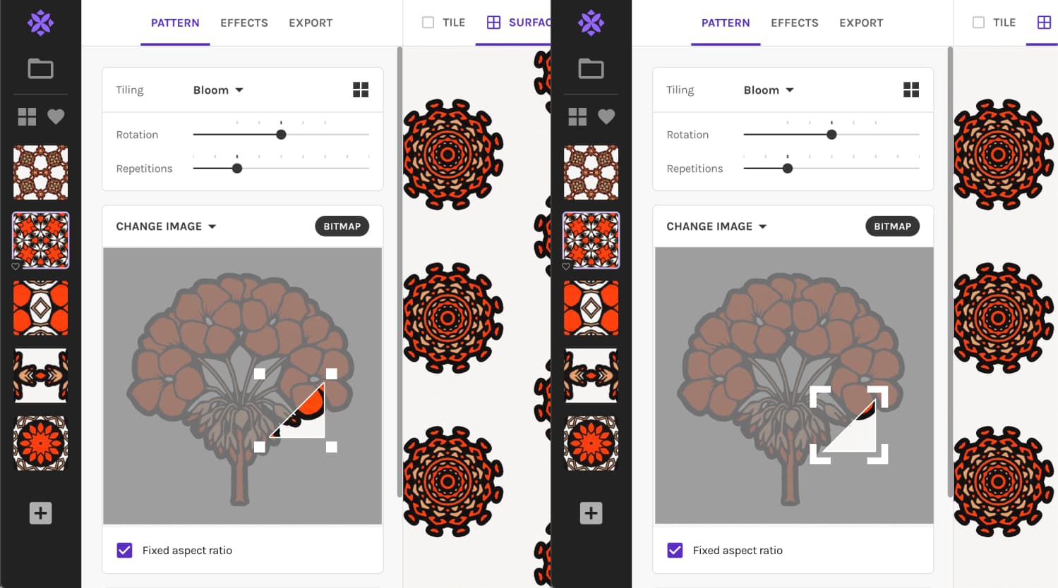
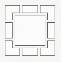
I was curious if we should actually simplify the handles. Most software uses squares for selection handles, while Repper uses arrow-like handles. The arrows are more instructive, but also block more of the view.
@MeyAroyo: Ratio sounds like a good idea for tilings with a sample that can have a variable aspect ratio! Those are the ones with all 8 resizing handles:
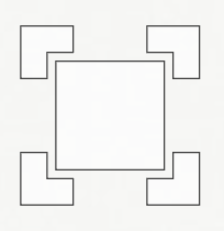
Note that most tilings have a fixed aspect ratio that cannot be changed (geometry won’t let us ). Those are the ones with the resizing handles only on the corners.
For tilings with a fixed aspect ratio, there is the option to disable to fixed aspect ratio. This only unlocks the aspect ratio of the selection, not of your pattern. Again, geometry won’t let us, as we cannot make a square pattern out of a sliver of a triangle. Instead, it will stretch the contents of the selection to fit the tiling. (those tilings have “fixed aspect ratio” enabled by default because in most cases you wouldn’t want their source material stretched)
I also think it works fine most of the time, but not so well on busy source images. I also sometimes struggle seeing exactly what is selected because of that. It sounded like others had that sometimes too, so I’m exploring how we may improve it (while keeping what’s already good about the selector).
Since we have a forum now, I figured: why not do some “development in the open”, show the process, and invite people to give their feedback!
Hi and thank for the continuous development of this very very useful application.
But, regarding the new improved selector, I must say that I don’t like it at all :(:( . It really hearts my eyes when the image fades away when I move the sample selector (and I have no problem with my eyes )
To me is very hard to choose which part of the source image I want to use because the colors become faded for the rest of the image. If I want to use a lighter color from the picture I have to repeatedly move away the cursor of the mouse to see the true colors of the image.
It’s like driving in a foggy day
Can we have the option to use what type of sample selector we like? To me, the black&white option is the best.
Hi @Ionut_Dascalu, thanks for your honest feedback! So far we’ve only received positive responses, and personally I’ve experienced it as an upgrade, but I appreciate that there are also benefits to always having the whole image visible instead of the selection highlighted.
I can’t make promises, but I’ll give your suggestion a think!